
UFO Flying Saucers #5
 Another Gold Key Comics pick this week, with UFO Flying Saucer.
First glance, you get a very retro-pulp looking cover, this comic was made in 1975 but it looks like something out of 1952.
Further investigation leads me to actually find out who did the cover, which was Latin American comic artist Luis Dominguez
 This comic is actually an anthology of a few different UFO encounter stories, and whatd'ya know the internet actually knows who drew the interiors as well, credit goes to aritst Frank Bolle who apparently is still alive and working.
The comic is set in real-life and treats each story as something that really happened and were reading what the witnesses and 'case files' actually said.
The first true story is the tale about the Virginia Giant.
The idea focus of it being a 'true story' really dulls this comic down, we see no crazy mind fights, lazer cannons, or face raping aliens.
this particular story is incredibly uneventful.
boy goes camping, dog runs off, boy sees flying saucer, a giant comes out, dog growls at giant, giant walks away.
then for some reason the last page is '2 days later' and his sister sees a flying saucer while driving home.
thats it. really. thats the end. it says 'this case has been studied extensively for 3 years with no explanation found'
how can scientists study and find an explanation from a 8 year old boys story and his teenage sister claiming she saw something 2 days later as well?
really?
and thats the best case file you can find that scientists extensively studied?
LAME.
the next story is even more of a bland UFO encounter story.
so bland i didnt even bother to scan any of it in.
its a 2-page story of a fugitive running from the police, when hes deep in the woods and thinks he lost them he sees a motionless, orange glowing, rectangle in the sky. He's scared for a second because he thinks its a police tracking device but it soon jets off into space in 2 seconds flat. He then got caught and he's writing this story to the editors from a prison cell.
whippee doo.
next.

This 2 page feature is probably the best in the book.
so good i just scanned and posted the whole thing above.
just classic looking alien profiles.
i particularly like the sexual predator looking venus alien in the red jammies, page 2 panel 3.

This story really has nothing to do with UFO's, but whatever.
this is the story of the invisible groper, it goes around making wind lines appear around people while grabbing and feeling them.
above youll see poor Mrs. Bee being lifted against her will and sexually violated.
I'm really into the 4-color treatment that was done here, Mrs. Bee has her 'full color' body with the blue coat, pink dress and white gloves and scarf, while her middle ground object is solid gray brick wall with cross hatching, and the background houses are red with an even light orangish sky, then once shes nabbed everything besides her goes green.
I used to take a lot of coloring techniques for granted, thinking for instance that Frank Bolle IS the artist and the colorist is just some secondary dude not even paying attention to his job. I see now the importance to differentiate the color choices between the planes to make distinctions, read distance, and in the last 2 panel cases to make sure you know when someones getting attacked. although i would have had the first panel with the green background and when she gets attack it then turn red, red being the more aggressive color.

The next comic is a cynical 'don't trust the government about UFOs' niche story.
The Maury Island Mystery is told through 2 high-ranking government guys, one a skeptic the other a believer, going over the evidence of the case.
the case being a UFO that was DUI started shitting out metal fragments which injured some sailors and killed a dog.
 this is the only cool action packed panel in the story.
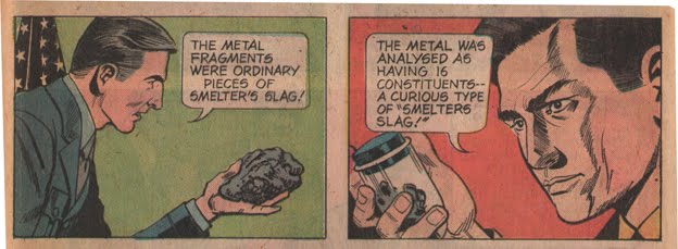
the rest is boring talking head panels arguing back and forth whether UFOs are real or not.
blah blah blah.
it ends with one guy believing it was aliens and the other guy not. how memorable!

The last 'story' is actually true! like for real real true. The narrator, 'the hoaxmaster', however is not real.
the story being the recollection of the War of the Worlds radio broadcast back in the 30's.
Above is another awesome example of good 4-color process coloring. notice the whites of the eyes and teeth in the flat color people, ups the dramatics!

and this last panel is probably my favorite in the whole book.
just some more great colors in psychedelic circles.
this Gold Key comic was way better then Wacky Witch, but still not good.
I'm on the fence with a lot of this classic looking house style in these comics. I know where the artist is coming from with the ways they take care of narrative problems through compositions, but they just seem so sterile to me. And i have read about different grid and panel composition techniques, just about every page in this comic has 4 perfect square panels and one long one, it just gets old to me, i like to see my comics with seemingly random panel layouts that the artist either put no thought into it at all or so much thought it looks like they didnt put any thought into it. It might just be from my strict diet of art comics, mini's, and art object books that makes me just brush off these styles as crappy assembly -line-get-it-done-fast type comics, which this is, but sometimes i just look at it and say 'meh, whatever dude'.
No comments:
Post a Comment